
The Golden Ratio: When Math Meets Art
Layouts.
When it comes to the internet, whether you’re paying attention or not, your every experience and interaction is governed by layouts. What caught your attention first with this article? What drew you to this paragraph? Every element on a web page is placed where it is for a reason, and that’s to form a visually pleasing arrangement of text, graphics, and other elements.
One fascinating aspect about layouts, though, is how it’s governed by something familiar to all of us: math.
Specifically, the Golden Ratio.
WHAT IS THE GOLDEN RATIO?
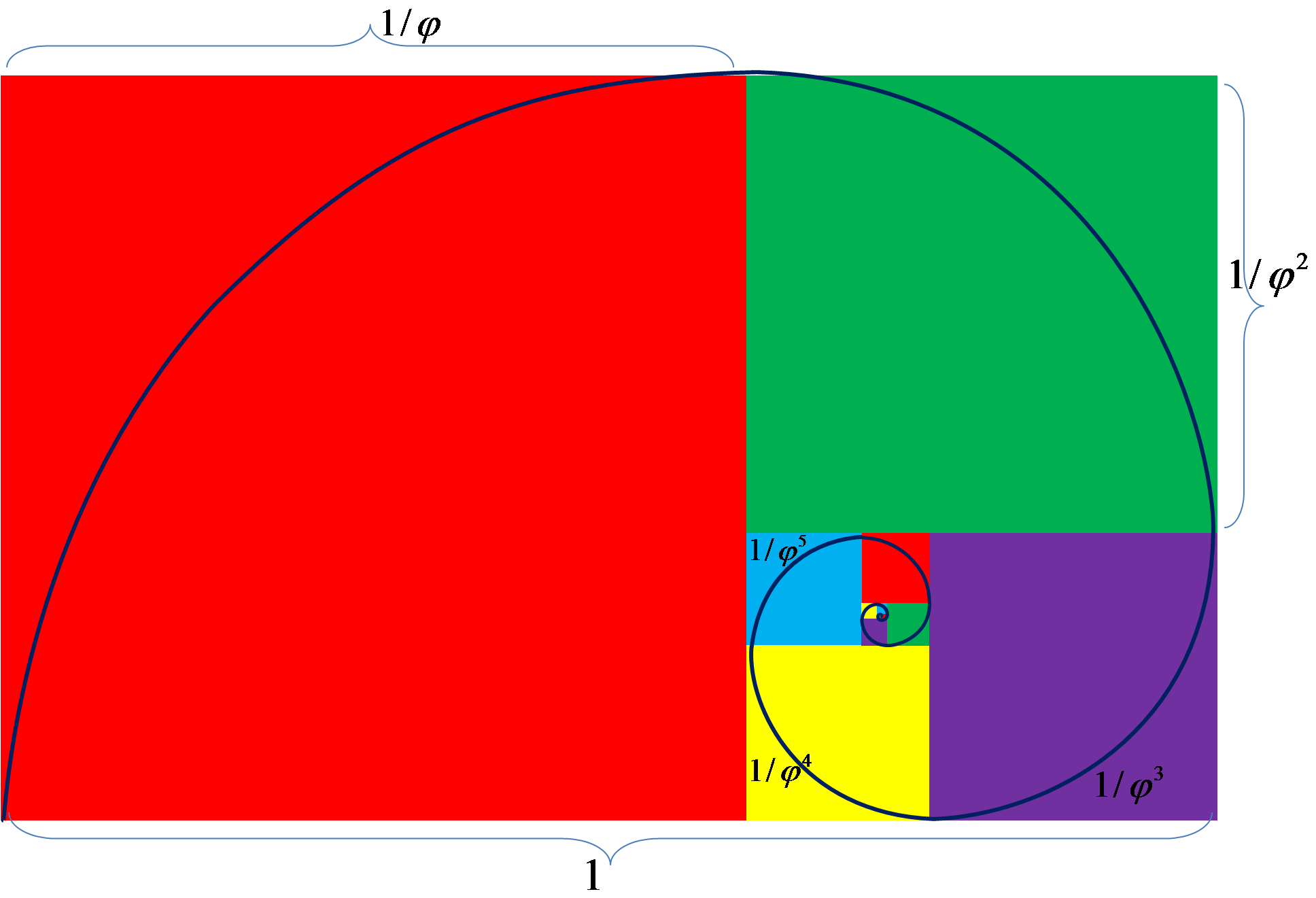
The Golden Ratio is a layout principle where a line (or page) is divided into two parts, with one part equal or less than roughly half of the other part. Sort of. There’s actual mathematics involved, with an equation(!) unique to itself. From Da Vinci’s Mona Lisa to the Pepsi logo, the Golden Ratio has reigned supreme as a guide for many popular works throughout history.
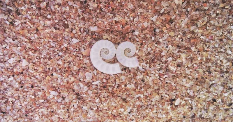
It’s not just in art, either. The Golden Ratio is ever-present in nature. Have you looked at the spiral of a conch shell? What about a photo of a storm taken from space? Or a photograph of a human ear? These are natural-occuring instances of the Golden Ratio.
This isn’t an accident, as the Golden Ratio is interconnected with another mathematical principle regarding sequences that has – interestingly enough – found itself as an indicator for exponential population growth: the Fibonacci Sequence. See, if you take a number from any point in the sequence and divide it by the number preceding it, you get a number that’s tantalizing close to 1.618. Cool, right? This number is called phi, and is a key factor in the mathematics of the Golden Ratio.
If you divide a line into two parts, and then divide the length of the longer half with the length of the shorter half and get 1.618 as a result, then your line has been divided according to the Golden Ratio.
HOW DOES THIS APPLY TO DIGITAL MARKETING?
The Golden Ratio is a layout principle, and when it comes to designing attractive and memorable branding, it’s difficult to go wrong with it. Quick: think of the Twitter logo. Easy to remember, right? Did you know the logo is 99% Golden Ratio? In fact, popular logos like the National Geographic’s and Toyota’s logos also adhere to the principle.
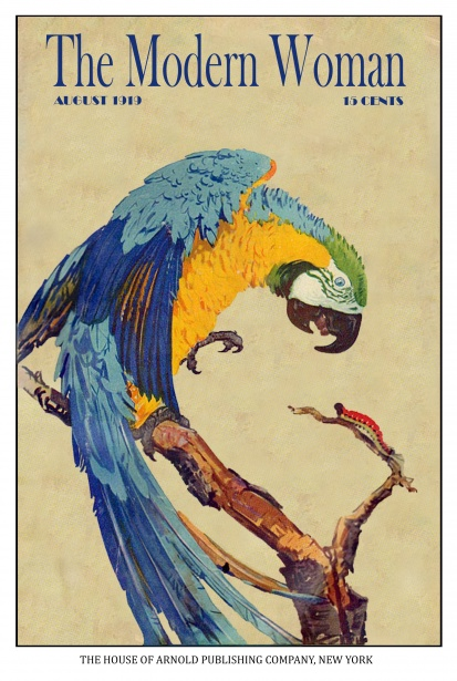
It’s not just logos, either. From print layouts to web design, the Golden Ratio governs the stacking of elements. Look at the example below; notice how the parrot follows an arch that draws your eye towards the title? The spacing between the elements of the cover is intentional as well; ⅓ of the cover is just empty space to give the eyes somewhere to “rest”, while the remaining ⅔ of the page is laden with elements, like the illustration and magazine title.
IN SUMMARY
You can play fast and loose with the Golden Ratio; it’s a principle but not a hard rule. Being aware of the Golden Ratio can help bring balance to the visual elements of marketing efforts, though, so if you get a chance to utilize it, go for it!
After all, first impressions last, especially in marketing, and if the Golden Ratio helps you make the best one, then why not try it out?
Did this article spark your interest? Would you like to see more articles like this? Let us know in the comments!